Dyslexia is a neurological condition characterized by impairment in one’s reading, writing, and spelling capabilities. It is often associated with language processing and visual processing disorders.
However, the implications behind the condition are much more complicated. There are multiple subtypes of Dyslexia that can cause reading problems in different ways.
Some impact a person’s ability to recognize the visual structure of letters and numbers, whereas some impact phonemic awareness.
Visual Dyslexia is one of the most frequent types of Dyslexia and can make it difficult to process, recognize and understand the visual structure of written material.
Here is a related article that might interest you on Best 5 Smart Pens For Dyslexia | Do They Really Help?
Multiple educators, psychologists, and researchers believe that the simplicity, cleanliness, and familiarity of a font can improve the speed, accuracy, and ease of reading text. Some dyslexia-friendly fonts and their pertaining benefits are explained below.
Table of Contents
What are Dyslexia Friendly Fonts? Arial
One of the main indicators of improved readability is familiarity with the font. Arial is a frequently used font and, therefore, an excellent choice for keeping material accessible for those with Dyslexia. It is also considered a cleaner font compared to serif fonts such as Times New Roman.
- One reason for its viability is the lack of distracting visuals.
- Compared to other fonts, it uses straight lines to communicate each letter.
- The distracting serifs around at the end and top of the letter can make reading more confusing as they make each letter less differentiated.
- Arial also uses thick strokes throughout the letter, which makes processing the visual structure and therefore recognizing the word easier.
- Another factor to consider is the level of crowding; some fonts, especially those with stylized flourishes, can make text look too crammed. This affects an individual’s already compromised processing and decoding abilities as the different letters look jumbled up with each other. In such a case, affected individuals often struggle to differentiate the end of one letter from the beginning of the next one. Most sans fonts have an evenly spaced construction which makes words and sentences look more separated.

Comic Sans
While most academic and professional material avoids the usage of Comic Sans because of its bouncy and childish appearance, it is a highly accessible font. It has all the benefits of a sans font which makes it cleaner, more straightforward, and free of distractions.
- Comic Sans is one of the most awarded and praised fonts when it comes to accessibility and ease of comprehension. An association of designers, AIGA, concluded that it might be the best solution to making the text more readable for individuals with Dyslexia.
- The unique shape of each glyph makes each letter highly differentiated from the other. The font also has very few mirrored letters compared to other fonts.
- The bouncy nature allows for easier differentiation between commonly confused letters such as “p”, “q” and “n”, “u”.
- The irregularity in letter shapes makes it easier to decode for some individuals.
- Besides readability, the font is highly recommended as it encourages young learners to read more due to its fun nature.
- Moreover, it mimics the average handwriting and can seem more familiar than most computer-based fonts.
However, it’s important to teach in a font that will prove helpful to the learner in the future. Because Comic Sans is not a widely used font, it may become difficult for learners to readjust their minds to the more commonly used fonts such as Times New Roman, Helvetica, or Arial.

(The Comic Sans Font)
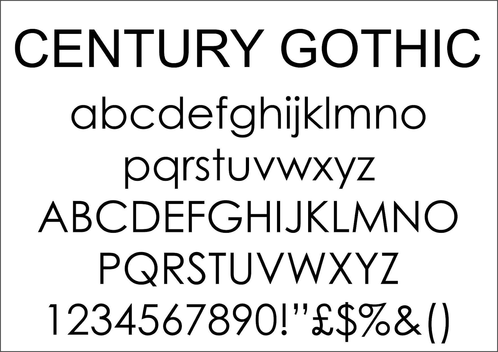
Century Gothic
Century Gothic is also a widely used font and can help with letter differentiation.
- Compared to other fonts that use narrow and thin letter shapes, Century Gothic has highly pronounced visual structures.
- The font has wider letters which allow for a more prominent presence of each letter. It also comes with thick strokes and no serif distractions. However, the font may not do very well for children with a tendency to reverse letters. This is because the uppercase “M” and “W” and lowercase “p”,” q”,” b”, and “d” are highly identical compared to fonts like Arial or Times New Roman.
- Overall, it’s a relatively clean font and makes readability easier for not just those with Dyslexia but other individuals with some form of language processing disorder or vision problems.
Fonts Purposefully Designed for Dyslexia
While the evidence for their effectiveness is lacking, there are some popular fonts designed with the needs of dyslexic individuals in mind.
Most of the fonts mentioned below target the specific processing problems most affected individuals encounter, such as letter reversals, differentiation, and recognition.
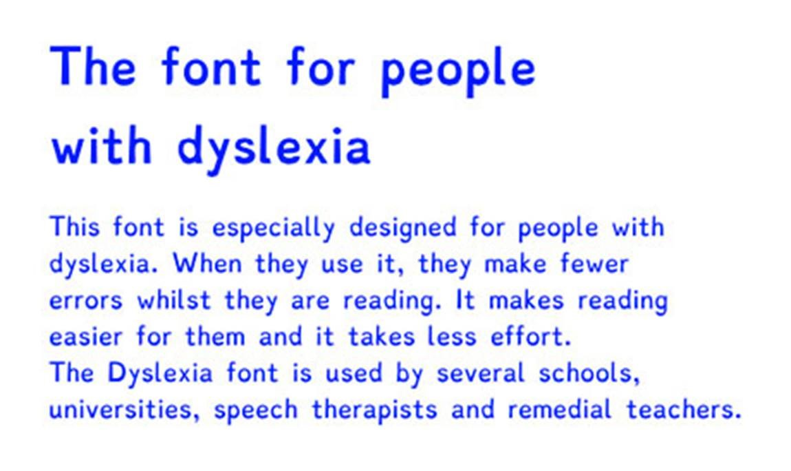
Dyslexie Font
The Dyslexie font was designed by a graphic designer who himself had Dyslexia. His aim was to ignore the conventional typography rules and focus on creating a font that compensated for the typical challenges Dyslexic individuals face.
While research is still unsure, some smaller-scale studies have found an improvement in reading speed and accuracy when using the font.
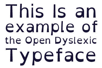
Open Dyslexic
The font is identical to the Dyslexie font, and the only exception may be that it is free for usage. The font is designed to increase the individuality of each letter by adding more characters to them using a combination of bold, thin, and italic typefaces.
However, most researchers have not found any conclusive data regarding its viability.
The Case of Dyslexia-Specific Fonts
There are dyslexia-friendly fonts, and there are dyslexia-specific fonts. It’s important to focus on the former rather than those designed for Dyslexia. The common approach used to make the letters more unique is also highly criticized in most non-friendly fonts such as Courier, and Papyrus.
Another post that will interest you is about the Best Laptops, Kindle, and Tablets for Dyslexia 2022.
The two fonts mentioned above use inconsistent font thickness where the top half is thinner than the lower half.
This can have a counterintuitive effect where children find it harder to process such a complicated structure. It’s also important to remember that the primary goal of education, learning, and reading is to become an independent person within society.
By using obscure, lesser-used fonts such as Dyslexie or OpenDyslexic, the learner might become excessively reliant on these fonts. It is a better idea to help children build familiarity with the widely used fonts that will benefit them when they reach adulthood.

Hi, my name is Eddie, I am a professional trainer specializing in the elderly population and I’m also a website designer. I love training in the gym, going to the beach, traveling, and having good food.
I combined my love for sport and website designing to make “DisabilitEase” whose purpose is to help elderly and disabled people live a more full and active life, have more fun, and enjoy their unique journey despite any disability.