Table of Contents
There are many problems that visually impaired individuals face in their daily lives. These problems are primarily associated with reading and writing, so these individuals must be provided with accessible material. For someone visually impaired, fonts are as vital as bread is to humans.
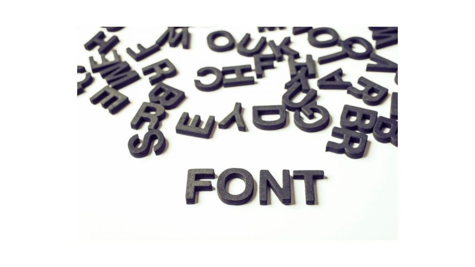
There are countless fonts in the world, and sometimes, the most creative fonts aren’t easily accessible or readable. These fonts often look strange on larger prints.
Recommended Products
Keyboard

Visually Impaired Keyboard
High Contrast Black and White Keys Makes Typing Easy | Perfect for Seniors and Those Just Learning to Type
Magnifying Desk Lamp

Brightech LightView Pro Flex 2 in 1
2.25x Light Magnifier, Adjustable Magnifying Glass with Light for Crafts, Reading, Close Work
OrCam

OrCam MyEye Pro
The Most Advanced Wearable Assistive Device for the Blind and Visually Impaired. Featuring Smart Reading, Face Recognition, Color & Product Identification
What Are The Best Fonts For Visually Impaired Individuals?
After researching and learning the subject, I came up with this list of the best font types for people who are visually impaired or have low vision.
1. Arial
Arial is the finest quality font out there for people with severe vision issues. As every font is simple and quite unique, it is easy for people with visual disabilities or low vision to access it. The letter looks fantastic when written in bold type.
Additionally, Arial can be used with digital materials, making it easier for people with low vision to use those digital gadgets. It is a premium quality font, and that is why it is pre-installed on every computer, making it much easier for people with visual impairment to use a PC.
2. Helvetica
Helvetica is a designer’s choice font. It is a rich font and comes in various weights. It is lighter on the eyes and enlarges beautifully. Helvetica is somewhat similar to Arial when it comes to appearance, but for people with visual disabilities, it is recommended to use the font on an inverted display. Helvetica is a premium choice for people who want to read light text on a dark background.
Although the font is lighter on the eyes, it is a heavy font. It helps people with low vision or visual impairment to focus on the page easily. Just like Arial, Helvetica comes pre-installed on computers and makes it easier for people to focus on the screen.
3. Bebas Neue
The unique thing about Bebas Neue is that the font flexes about its all capital letters and shows off clean lines. It is a font admired by many visually impaired individuals.
It has a well-defined shape that makes it easier to read. It is the best font for headings, as it is easily recognizable on the page and is fine for usage when it comes to creating logos or writing headings.
4. Calibri
Who isn’t familiar with the champion font? Calibri is the default font of Microsoft Office, and there are many good reasons behind it. The font is admired by many writers and is the most popular choice of people with serious visual issues. It is highly legible in large prints, and its letters can be easily distinguished from one another.
The letters “a” and “u” can be easily distinguished by people with serious visual disabilities, making it the wisest choice for people with severe visual impairment. Most of the apps include Calibri in their databases to allow visually impaired individuals to run the apps properly. It also comes pre-installed on computers.
5. APHont
It is specially designed for people who are suffering from common visual issues. It is the finest choice for people who are suffering from serious visual disabilities. The font is created by the American Printing house solely for assisting the people in reading quickly and clearly by the visually challenged people.
Some of the alphabets under this font have longer tails to distinguish from others. The font is totally free to use, but one has to certify that it will only be used by the person who is visually challenged. The font is gaining more and more popularity each passing day.
6. Comic Sans
Comic Sans has been seen as the most disgraceful font in many people’s eyes, and some have even marked it as a useless font that has ever been made. But did you know that it is the most helpful font for dyslexia patients and is the sole friend of visually impaired individuals?
Due to this reason, you can find it anywhere. As the alphabets of this font are bulgy, this makes it easier to focus on and looks unique. It is an awesome font for people with low vision and premium for permanent visual disabilities. Due to these reasons, it comes pre-installed on computers. It is also prominent in apps and gadgets made solely for visually impaired people.
7. Lavanderia
Although cursive fonts must be avoided wherever possible, even people with visual impairment must start learning a thing or two about the cursive font. When it comes to cursive fonts, people with low vision cannot find anything better than this font.
Due to its heavyweight and unique alphabet style, it is beneficial for people learning to write but facing difficulties because of visual issues.
Before moving on to the worst fonts for the visually impaired, feel free to check out my related post about the 10 Worst Fonts for Dyslexia.
What are the worst fonts for visually impaired individuals?
It is scientifically proven that fonts affect people with serious visual impairment or dyslexia. Some of the fonts make it annoying for these people to focus on what is written. Here are some of the worst fonts that affect people’s learning ability with low vision or serious visual impairment.
- Copperplate Gothic
- Trajan Pro
- Courier
- Souvenir
There are plenty of fonts out there that aren’t easy on the eyes of the patients suffering from visual disabilities. Experts have recommended not to use any font in italic or underlined order. They have also suggested that people must not use fonts that are dull and have nothing outstanding about them.
Choosing an accessible font for a visually challenged person
The choice of font can directly impact the person reading or writing something on a digital gadget. Some fonts can be easily read and understood, while others can lead to tearful eyes even for ordinary people. That is why choosing an accessible font is necessary for the message to be conveyed. Many people don’t have the slightest idea how hard it is for visually challenged people to access some of the fonts. People who are suffering from dyslexia aren’t the only ones who find some fonts challenging.
What makes a font inaccessible?
Fonts that are ornate or very elaborative cannot be easily accessed. Fonts with undefined letter shapes or irregular sizes are harder for people with visual impairment to access. The same applies to handwriting-style fonts, which have gained much popularity in a lot of communications.
Which fonts are the most accessible of all?
Although it has already been discussed in detail above, some of the most accessible and widely acclaimed fonts include Arial and Calibri. After that comes Century Gothic and Helvetica. All of these fonts fall under the category of sans serif. Serif is basically a small decorative line that can easily be seen in some other fonts like Georgia or Times New Roman.
However, sans serif refers to the fonts that do not carry the decorative line. It is difficult for some people to read the serif fonts because these aren’t lighter on the eyes and distract the brain from the overall shape of the letter. Serif fonts could become a problem if used in digital publications because of pixilation issues. Pixilation on the screen can become a problem as the screen can distort the serif font, which then causes the words to blur around their edges.
What colors are best for the visually impaired?
Basically, if we use serif fonts with red and green colors, it might be easier for the people with the visually impaired to focus on the words. Dark colors and dark hues are also necessary for people with low vision.
What fonts are AODA compliant?
As we have discussed the whole concept in detail, still to summarize it, all the most accessible fonts are Arial and Calibri. But there are some other fonts too that can be used in headings rather than the body text. However, serif fonts must be avoided at all costs.
What is the minimum font size for the visually impaired?
Even for a visually challenged person, one must aim for a font size of 12. If you are pushing out on space, you can go as low as 10, but not below that. Although experts have recommended that the minimum font size for visually challenged people must be at 14 points, still 12 will do just fine.
Is there a Braille font?
Yes, there are plenty of braille fonts. Even the internet is full of fonts, and some of these are free to download. However, each of these fonts has a particular purpose. Additionally, many fonts are similar to each other in design but are used for entirely different reasons.
What is the legal font size for the legally blind?
For legally blind people, the setting of the font must be at 12 points, and it should be the last setting. It adequately addresses the needs of the people who are visually impaired and must be used by people with low vision or who are legally blind.

Hi, my name is Eddie, I am a professional trainer specializing in the elderly population and I’m also a website designer. I love training in the gym, going to the beach, traveling, and having good food.
I combined my love for sport and website designing to make “DisabilitEase” whose purpose is to help elderly and disabled people live a more full and active life, have more fun, and enjoy their unique journey despite any disability.