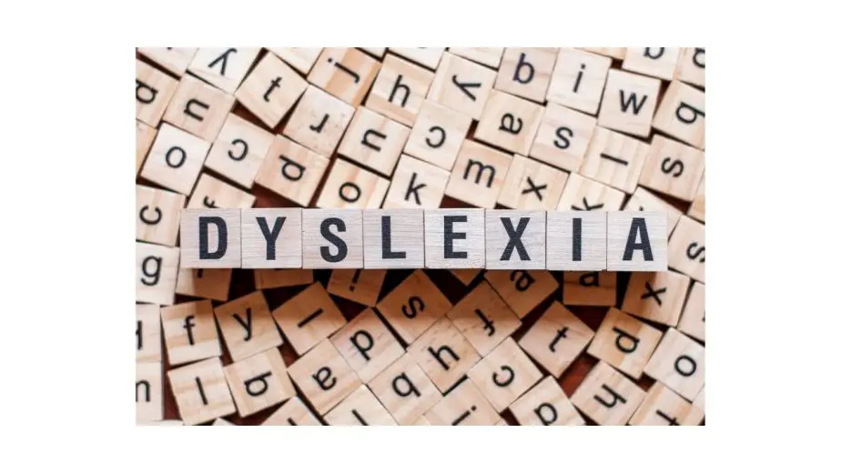
Dyslexia is a condition where the person struggles to relate letters and words.
If you have this condition, it’s important that you use the combination of technology and the right font to ensure that you could easily read text.
While I have already covered the best Fonts for Patients with Dyslexia, I thought that I should also cover the fonts which you should avoid if you have Dyslexia.
In this DisabilitEase guide, I will share the 10 Worst Fonts for Dyslexia. Let’s get into it.
Table of Contents
What Makes The Font Worst For Dyslexia?
Dyslexia is a syndrome that affects more than 40 million people worldwide. In this condition, a person struggles to relate words and letters, which’s why it’s important that you choose a simple font so that you could read it right.
According to the study by the University of Michigan, they concluded that italic fonts are the worst for Dyslexia because their shape makes it difficult for people with Dyslexia to read properly.
Similarly, if the fonts have too many curves and uneven strokes, it can get difficult for people with Dyslexia to read them properly.
10 Worst Fonts for Dyslexia
Now that you know what makes the font worst for people with Dyslexia, let’s have a look at the 10 Worst Fonts for Dyslexia. Let’s get started.
1. Brush Script
Let’s start with Brush Script, which is arguably one of the worst Fonts for Dyslexia. It’s a casual connecting script font that was designed by Robert E. Smith in 1942 for the American Type Founders (ATF). The reason why it’s the worst font for Dyslexia is its style.
The fonts in Brush Script are connected with each other and also are in italics which makes them incredibly difficult for people with Dyslexia to read. So, if you have Dyslexia, you should avoid Brush Script.
2. Papyrus
Papyrus is another font that is not suitable for people with Dyslexia. It was designed by a famous graphic designer and illustrator, Chris Costello, in 1982 and was launched in 1983.
The reason why Papyrus is one of the worst fonts for Dyslexia is its design. Papyrus’ characters come with rough edges, irregular curves, and high horizontal strokes, which make it difficult for people with Dyslexia to read the text.
3. Neuland Inline
Neuland is another very popular font that is the worst font for Dyslexia. It was designed by Rudolf Koch, a famous typographer, back in 1923. Neuland Inline became really popular when it was featured in the title of Jurassic Park.
The reason why Neuland Inline is the worst font for Dyslexia is that it comes with irregular shapes and unconventional curves, which make it difficult for people with Dyslexia to read it.
4. Ecofont
Ecofont is an award-winning font that was designed to save ink consumption, and it saves up to 25% ink consumption. That’s why it was nominated for European Environmental Design Award and won it.
Now the reason why Ecofont is not the ideal font for Dyslexia is that it comes with a dotted design which confuses people with Dyslexia. So, it’s recommended that you avoid Ecofont and go for more dyslexia-friendly fonts.

5. Broadway
Broadway is another classic font that is one of the worst fonts for Dyslexia. It was originally designed by Morris Fuller Benton for American Type Founders (ATF) in 1927, and it was discontinued by ATF in 1954. However, it’s still very popular and used to give a classic look to documents.
Now, the reason why it’s the worst font for Dyslexia is that it comes with irregular shape and curves, which confuses people with Dyslexia and make it difficult to read text.
6. Chiller
Chiller is a very popular font that happens to be one of the worst fonts for Dyslexia. It was designed by famous British Designer Andrew Smith. This font carries the horror theme, and that’s why it comes with irregular shapes and rough edges, which makes it difficult for people with Dyslexia. So, if you have Dyslexia, you should avoid using Chiller Font.
7. Bauhaus 93
Bauhaus 93 is one of the most popular fonts, and it has been featured in famous logos, including Postman pat Logo, Amiibo Logo, as well as on Disney’s Polynesian Resort. However, it’s not an ideal font for people with Dyslexia because of its shape. Bauhaus 93’s characters come with irregular shapes and bold looks, which make it difficult for people with Dyslexia to read them.
8. Harlow Solid Italic
Harlow Solid Italic is a popular font that comes in Microsoft Office. This font carries the classic look of the fonts from the 1940s and 1950s. The reason why you should avoid this font is its shape. The characters of Harlow Solid Italic come with a very unconventional look and style, which makes it difficult for readers to understand them.
9. Magneto
Magneto is a very popular font that was designed by American Industrial engineers. This font recalls the lettering which used to be found on the refrigerator doors, compressors, and trunks of the automobile. The reason why Magneto is one of the worst fonts for Dyslexia is that it comes with a bold look and connected look, which makes it unsuitable for people with Dyslexia.
10. Onyx
Onyx is an iconic font that was designed in 1937 by the American Type Founders, and it is inspired by “Stephanie,” which was a font issued by Bauer Foundry in 1870. The font comes with a high-wasted character with a combination of thick and thin strokes, which give it a very elegant look but at the same time make it unsuitable for people with Dyslexia.
Conclusion
That’s all, folks. These are the 10 Worst Fonts for Dyslexia which you should avoid in 2021. However, these are not the only worst fonts, and I’m sure you have come across other worst fonts at some point in your life.
Please feel free to share them with the community in the comments section. Also, check this guide where I have shared the Best 8 Free Software, Apps, and Games for Dyslexia.

Hi, my name is Eddie, I am a professional trainer specializing in the elderly population and I’m also a website designer. I love training in the gym, going to the beach, traveling, and having good food.
I combined my love for sport and website designing to make “DisabilitEase” whose purpose is to help elderly and disabled people live a more full and active life, have more fun, and enjoy their unique journey despite any disability.