Google Docs and Microsoft are two of the most popular word processors, and they come with a number of fonts that you can use.
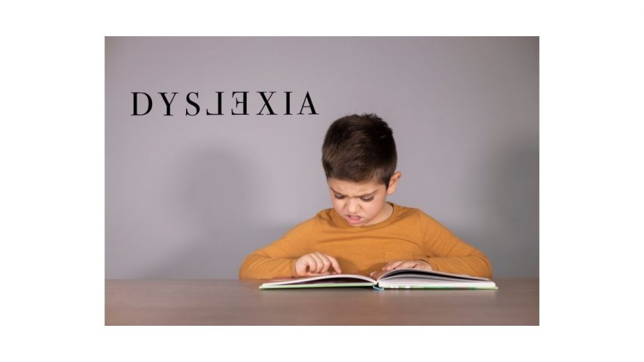
They also come with many Dyslexia-friendly fonts, which make it easier for people with Dyslexia to read the text on the screen.
Here is a related article that might interest you on the Best Laptops, Kindle, and Tablets for Dyslexia 2025.
In this DisabilitEase guide, I will share the Best Fonts for Dyslexia in Google Docs and Microsoft Word. Let’s get started.
Table of Contents
What Makes A Font Dyslexia-Friendly?
It’s an established fact that some of the fonts are more readable than others, and it mainly depends on the style, height, weight, and shape of the fonts.
As Dyslexia is a learning disorder where the person faces difficulty in reading, it is important that you pick a font that is easier to read. That’s why Dyslexia-friendly fonts are designed in a way that each character looks unique.
Also check out my guide on the 10 Worst Fonts for Dyslexia.
For example, if you look at the Sans-serif fonts, they are more streamlined and have unique characters, which makes them easier to read.
On the other hand, if you look at the fonts like Georgia, you will note that they have tails and other features which make them difficult for people with Dyslexia.
Best 4 Fonts for Dyslexia in Google Docs and Microsoft Word
Google Docs and Microsoft Word are two popular word processors, and they come with dozens of fonts that you can use. However, only a handful of them is Dyslexia-friendly. Let’s have a look.
1. Courier (Google Docs)
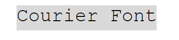
Courier is one of the best Fonts for Dyslexia in Google Docs. It’s a monospaced slab serif typeface that was designed by Howard “Bud” Kittler, and he designed it for IBM’s typewriters. However, later on, it was also adopted as a computer font, and now it’s pretty popular among people with Dyslexia.
There are also different variants of Courier available, but the one I’m recommending here is the original Courier, which you can easily find on Google Docs.
The best thing about Courier font is that it’s very slim, and each character comes with a unique shape design which makes it easier for people with Dyslexia to read it.
It was also concluded as one of the best Fonts for Dyslexia in one research by the University of Michigan. The research concluded that the Courier font is more readable for people with Dyslexia as compared to other fonts.
2. Arial (Google Docs & Microsoft Word)
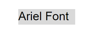
Arial is another very popular font that is ideal for people with Dyslexia. It was designed by Robin Nicholas and Patricia Saunders, and it has been featured on various applications, including Microsoft Word, Apple’s macOS, Google Docs, and others.
Like other fonts, Arial also comes with many styles, but the one which I’m recommending here is the regular version which offers better readability for people with Dyslexia.
According to a study by the University of Michigan, Arial font has great readability and performance as compared to Arial Italics, which reduced the reading speed of the participants.
3. Verdana (Google Docs & Microsoft Word)
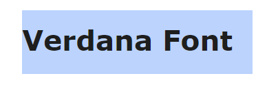
Verdana is arguably one of the best Fonts for Dyslexia in Google Docs and Microsoft Word. It’s a humanist sans-serif font that was launched in 1996, and it was designed by Matthew Carter.
The unique thing about Verdana font is that it was designed to be readable even on small screens with low resolution. Verdana character with x-height, which means that its lower-case characters are tall, which enhances the readability of the text.
Also, the research by the University of Michigan also proves that Verdana has the best readability and people with Dyslexia were able to read text written in Verdana easily.
4. Times New Roman (Google Docs & Microsoft Word)
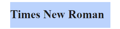
Times New Roman is a legendary font that has been around for more than 80, and it’s still very popular. It was first used on “The Times,” which is a British newspaper, but nowadays, it’s found on almost every desktop and word processor out there.
When it comes to design, Times New Roman is really good, and that’s the reason many designers took inspiration from it while designing fonts. As Time New Roman was originally designed for a newspaper, it comes with x-height, which means that the characters are tall, which makes it more readable.
The study by the University of Michigan also proves that Roman Fonts such as Time New Roman has better readability.
How To Choose The Best Font For Dyslexia Docs And Microsoft Word?
When it comes to choosing the best font for Dyslexia Docs and Microsoft Office, there’s no hard and fast rule.
According to a study by the University of Michigan, the participants were able to read the straight fonts more easily as compared to italics or scripts, which shows that you should always go for a simple font.
In this guide, I have only shared those fonts which come with a simple design and good readability.
I would recommend you to check these fonts on your computer and then pick the one which suits you.
On top of that, you should also use the accessibility options in your computer and Software, which will make it easier for you to read text on the screen.
What is the Best Font for Dyslexia in Google Docs?
Google Docs comes with a number of great fonts, but only the following fonts have proven to be effective for people with Dyslexia.
- Courier
- Arial
- Verdana
- Times New Roman
What are the Best Fonts for Dyslexia in Microsoft Word?
Microsoft Office comes with a huge collection of fonts that you can use, but if you are looking for dyslexia-friendly fonts, you should consider the following fonts.
- Arial
- Verdana
- Times New Roman
Conclusion
That’s all, folks. These are the 4 Best Fonts for Dyslexia in Google Docs and Microsoft Office. All of these fonts are proven to be useful in the study by the University of Michigan, in which 48 people with Dyslexia participated.
I would suggest checking all the recommended fonts and then pick the one which suits you. If you have any questions, please let me know in the comments.
Also, don’t forget to check our guide where we have shared Best 8 Free Software, Apps, and Games for Dyslexia.

Hi, my name is Eddie, I am a professional trainer specializing in the elderly population and I’m also a website designer. I love training in the gym, going to the beach, traveling, and having good food.
I combined my love for sport and website designing to make “DisabilitEase” whose purpose is to help elderly and disabled people live a more full and active life, have more fun, and enjoy their unique journey despite any disability.